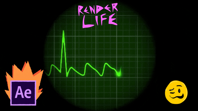
Sometimes the best tricks in motion graphics don’t come from a perfectly polished pipeline — they come from quick solutions that just work.
This post is about how I built a cardiogram animation in Adobe After Effects and Photoshop, used later as part of a heart concept (yes, a beating heart with music). The workflow is simple, a bit messy, and definitely not “by the book”… but that’s the beauty of VFX.
⚠️ Note: The tutorial video is in Spanish, since that’s my native language. Sorry for my English-speaking readers! But the steps are very visual, and I’ll break them down here so you can follow along anyway.
🎬 The Concept
The idea was to create a cardiogram animation that could be placed inside a 3D heart model. Every time the line hits a spike, the heart “beats.”
At first, I thought of filling the animation like a progress bar, but that felt too stiff. Instead, I wanted the cardiogram to run left to right, while the up-and-down rhythm stays centered. That way, the heart reacts to the motion, not just a flat meter.
🛠️ The Quick Photoshop Setup
Instead of spending hours designing a perfect grid, I did what most pros do in real life:
- I searched for “grid” on Google Images.
- Grabbed a random one, resized and inverted it.
- Duplicated the layers, stacked them to get smaller squares.
- Added a green overlay at 50% transparency.
Done. The “hospital monitor” look was ready in minutes.
🎨 The After Effects Animation
Inside After Effects, I kept it simple:
- Imported the grid background from Photoshop.
- Drew the cardiogram line with a mask path.
- Added a glow effect to make it look alive.
- Animated the mask so the line “runs” to the left while spikes stay in the middle.
- Synced the line with the heart model, so the peak matches the heartbeat.
It’s not overly complicated — just keyframes, masks, and some glow.
😂 About the Tutorial Style
This is not a formal, serious “masterclass.” I edited the tutorial video with GIFs, emojis, and funny inserts at the beginning to keep it fresh. Tutorials can get boring fast, and I wanted to show that the creative process can be fun.
Later in the video, when the important info comes in, I cut down on the distractions so you can focus on the technique. It’s half-entertainment, half-learning — that balance makes it easier to watch.
💡 Why Keep It Simple?
In the professional industry, speed matters. Clients don’t care how “perfect” your grid layer is, or whether you drew it mathematically. They care about results.
That’s the magic of visual effects: many times you don’t even know exactly what you’re looking at, but if it feels real, it is real.
As I like to say:
“You don’t need everything to be perfect or complicated to create something powerful.”
📺 Watch the Tutorial (in Spanish)
Here’s the video version of this process. Again, it’s in Spanish, but visuals are universal and you’ll be able to follow the steps:
✍️ Final Thoughts
This project is a reminder that creativity should stay fun. Whether it’s using a random grid from Google, adding a glow effect, or syncing visuals to music, sometimes the simplest tricks bring the best results.
If you enjoyed this breakdown, stick around — I’ll be posting more behind-the-scenes of how I build motion graphics and VFX.
Yasunari Murayama, video productor y editor profesional ubicado en Mexicali Baja California.
Cel: +52 686-231- 8946
🌐 Follow me:

Leave a Reply